図1は平田篤胤(1776-1843)の没後に最初に出版された『古今妖魅考』(弘化2:1845年刊)巻2の20丁裏にあたる箇所である。図からわかるように、文字が横に揃っている。横に10行並んでいるが、どの行も1行には25字が印刷されており、この版面に250字が印刷されている。この丁だけでなくどの丁もそのように印刷されている。
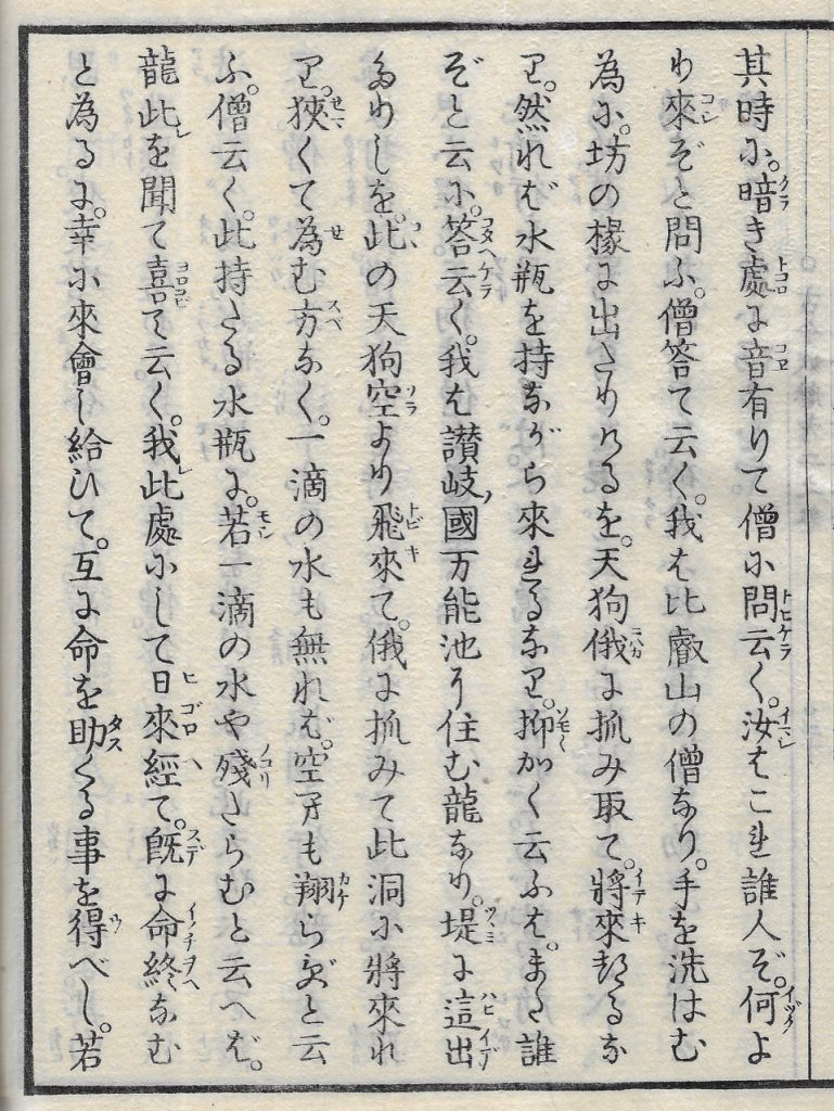
漢字と比して、平仮名の大きさはいくぶん小ぶりではあるが、いちじるしく小さいわけではない。また3行目「たり」「ける」「つる」、4行目「れる」、5行目「なり」、6行目「より」のように、平仮名同士の連綿はみられるが、漢字同士の連綿はみられず、漢字と平仮名との連綿もみられない。「どちらが先か」ということになりそうではあるが、漢字と平仮名の大きさがほぼ同じで、全体的に連綿がみられないということによって1行の字詰めが揃うといってもよいし、1行の字詰めを揃えるためには、そうである必要がある、といってもよい。
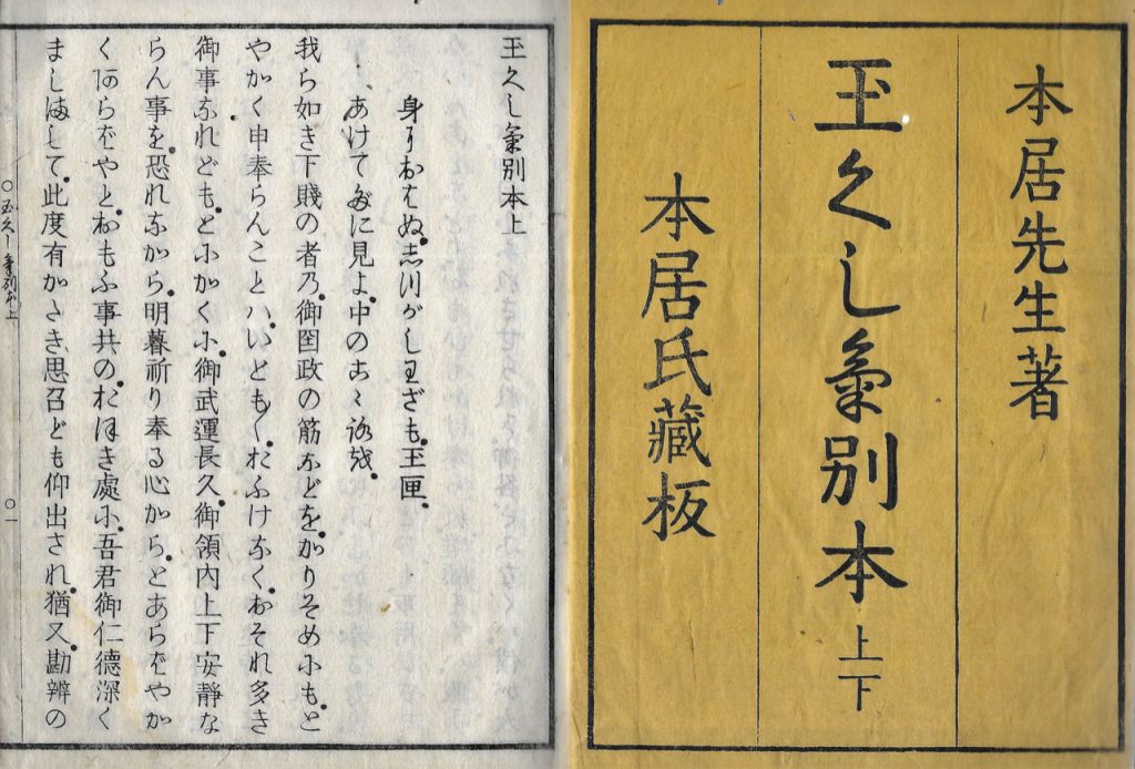
また図2は明治3(1870)年に出版された『玉くしげ別本』であるが、これも文字が横に揃っていることがわかる。半丁10行、各行24字という「フォーマット」に印刷されている。
矢田勉(2012)は第6編第2章「鈴屋の文字意識とその実践」において、寛政2(1790)年に第1帙の巻1から巻5が出版され、宣長の没後の文政5(1822)年に巻18から巻44までが出版された『古事記伝』を観察対象とし、『古事記伝』には「平仮名交り文でありながら、字の横並びを揃えていること。従って、一行の字詰が一定である」(613p)という「特異な表記方針」が採られていることを指摘している。また、「平仮名横並び書記」が「楷書体の漢字と平仮名との共存」(630p)というかたちで実現していることに注目し、「平仮名の横並びということは、本来一つ一つ異なる平仮名字体の字型(=字の大きさ)を規格化するということでもあって、平仮名を字型の整った楷書体の漢字と同列に並べることができるということである。活版印刷以降の文字文化にあっては当たり前のことであるが、整版時代には画期的なことであったというべきである」(631p)、「平仮名の横並び書記=平仮名の楷書的用法は、漢字平仮名交り文の活版印刷の基盤整備をいち早く成し遂げたものとして、先駆的意義を持つものである」(634p)と述べている(註1)。
手書きの漢字は行草書体によって実現しやすく、手書きの平仮名は自然に連綿を伴なうのであり、そのことからすれば、「楷書体漢字を使う」「平仮名の連綿が少ない」「1行の字詰めが揃っている」という版面構成は、「手書きにちかく印刷する」ということをまったく志向していないという点において、印刷における、一つの「到達」とみてよいだろう。
その「到達」までの状況について整理しておきたい。「実録体小説」と括られることがあるテキストとして、今野(2011)の第1章「江戸期から明治期への移行」において、『大岡仁政録』を、今野(2013)の第1章第2節「実録体小説の活字化」において、『大久保武蔵鐙』を、今野(2015)の第1章「テキスト間にみられる「揺れ」」において、『天下茶屋敵討真伝記』を採りあげた。ここでは、『悪狐三国伝』を採りあげることにしたい。
稿者が所持しているテキストを仮にA、B、Cと呼び、その冒頭の2行ずつを翻字して示すことにする。Bの裏表紙見返しには「嘉永六癸丑正月」と記されているので、Bは嘉永6(1853)年に書写されたことがわかる。Cの裏表紙見返しには「山梨郡/下小田原村/古屋傳久主」という墨書の上から「甲州山梨郡下小田原邑古屋林左衛門」と墨書されており、かつては山梨辺にあったテキストであることがわかる。Aには書写年時、所持者にかかわる書き込みの類は見あたらない。ここでは、A・B・Cは幕末明治初期頃に書写されたものと仮定しておくことにする。いずれも縦24-25センチ、横17センチの「半紙本」のサイズである。
次にA・B・Cの話の初めの2行を翻字して示す。
A よりにる地は天による
みなより先にたつ自天上よりB 天より地に寄る地は天による天地みな
五数よりふり泰山既にこんろんよりC 天元より地にるは天による天地
みな五数よりる泰山既こんろん
Aは多くの漢字に振仮名を施し、Bには振仮名が施されておらず、Cはところどころ振仮名を施すといったような、今後この連載でも話題にするようなことがらについての違いがある。また、この「初めの2行」にすでに上記のような違いがある。それは「テキストの変容」という観点からはきわめて興味深いことであるが、今ここでは話題にしない。
今ここで話題にしたいのは、A・Bは1行に収められている字数が異なるということである。これはつまり、1行に収める字数があらかじめ決められていない(決まっていない)ということでもある。
パソコンなどを使って文書を作成するにあたっては、最初に、あるいは最後に1ページに何行収めるか、1行に何字収めるかという「書式」を設定する。「書式」を設定すれば、その「書式」にしたがって文書は作成され、プリントアウトすれば設定した「書式」どおりに出力される。こうした「書式」は1ページに収める行数、1行に収める文字数が均等であることを前提にしている。1行に収める文字数が均等であるということは、文字の大きさも(基本的に)均等であることを前提にしているといってよい。
上に示した2行に続く10行を振仮名を省いて示してみよう。(図3は8行分)
くたる泰山已に崑崙従し而始る土坤
尊ふして五行の信を守る人道尊ふし
て萬もつの全しきをなすと伍子胥
か闘寳會の折から此六問を明す此こと
にして人間は萬物の長たり其萬物の
長たる人間の主従を犯す狐あり則唐
天朝の三国に傳來す始め唐土殷紂王
の后と也殷亡ひて後天竺にわたり
斑足大王の婦人となりまた唐土にき
たつて再ひ生化して周の幽王に近付
こうしてみると、たしかに1行に収められている文字数は一定ではない。しかしまた、16字を基準にすると、15字または17字の範囲に収まっていることもわかる。A、B、Cをみると、Aの「本文」は斉整と書写されているという印象をもつが、その「斉整と書写されているという印象」は、一つ一つの文字が丁寧にかつ流麗に書かれているということに加えて、1行に収められている文字数がほぼ一定であること、行と行との間隔が整っていることに由来する、現代日本語を使って言語生活を行なっている者(ここでは稿者)の「心性」によるものであった可能性がある。
江戸時代初期にはいわゆる「古活字」による印刷出版が行なわれていたが、寛永期以降は整版による印刷出版が常態となっていく。そうした印刷出版によって文字化されたテキストにふれることで、「1ページに一定の行数を収め、1行に(ほぼ)一定の文字数を収める」という書記形式をデフォルトとする「心性」が無意識裡に醸成されていった可能性を考えてみたい。そしてその「心性」が明治15年以降にひろまっていく、金属活字による印刷出版の広通を可能にし、原稿用紙の使用を一般化したと考えられないだろうか。
今野(2005)の第2章「手書きから印刷へ」においては、古活字版の『横笛草紙』を観察対象とした。橋本直紀編(1983)には2種の古活字本(甲本・乙本)の写真が収められている。例えば、その甲本の1丁表をみれば、「よこ」「ふえ」「さう」「ころ」「にや」「けん」「れい」「かる」「ほう」「侍り」「ける」「をは」「とき」「せん」「けん」「もり」「つく」「さい」「して」「くた」「たまへ」「いま」「ゆく」「くわ」など、多くの連続活字が使われていることがわかる。「侍り」や「たまへ」のような連続活字は「ハベリ」「タマヘ」がある程度の頻度で使われるであろうことからすれば、そのようなものを作っておくことがひとまずは理解できる。しかし「さい」や「くわ」などは、一つのテキストの中に、こうした文字連続がどのくらい出現するのかと思わざるを得ない。そうしたことからすれば、連続活字は、活字をつくって印刷をするという枠組みの中においては非効率的といわざるをえない。非効率的であるにもかかわらず連続活字をつくり、それによって印刷していたのは、手書きのように印刷することを志向していたためであろう。つまり、この時期の文字化は手書きをデフォルトとする「心性」にうらうちされていたことが推測される。
その、「手書きをデフォルトとする心性」は結局は、活字による印刷から整版による印刷への移行を促したのではないか。整版による印刷は、活字をつくって印刷するということからすれば、非効率的ということになるが、「手で書くように印刷する」という「心性」には合致するものであった。また、整版印刷は、1つのテキスト、1つの版面の中に、絵と文字とが「同居」することを可能にし、振仮名の使用も可能にした。
明治時代になって、金属活字による印刷が常態になると、振仮名も使われるようになる。それでも、振仮名には「本文」よりも小さな活字を使わなければならず、その小さな活字が印刷に際しても、ずれたり、顚倒したりしないようにするためには、一定の「技術」が必要であった。「本文」と「振仮名」とは文字の大きさが異なっている必要があり、文字の大きさが異なることで、振仮名がいわば「注釈機能」をもったものであることがわかるようになっている。あるいは「本文」が「漢字平仮名交じり」であれば、振仮名に片仮名を使うことによって、振仮名が「本文」とは異なる、ということを示すこともできる。稿者は、振仮名を含めて「本文」をとらえているが、文字の大きさ、振仮名がはたしている「注釈機能」に着目した場合、振仮名を「本文」と切り離してとらえることは可能であろう。
図4は天保5(1834)年に出版された柳亭種彦(1783-1842)の『邯鄲諸国物語』初編(近江の巻)前帙上の末尾である。「本文」が2段に分かれているが、その上段を翻字して示す。2字以上の繰り返し符号は「々々」に置き換えた。
おかなはそつとわが
ねやへたちもどらんとみを
ひそめしやうじのすきより
さしのぞけばおたゞはよねん
たあいもなくよぎよりかた手
さしいだしかすかにひゞくいびきの
こゑ母のお山は目をさましおき
かへりつゝあんどんの火にてたばこを
すひつけつきゝみゝたつるそのふせい
なむさんぼうとおかながぎやう
てんなをもかたへにみをよせて
いきをのんでぞかくれゐるお山は
それときもつかずしが
ゑもんをゆりさまし
なにかきんじよが
ざわ々々ともし人ごゑ
がするやうなといふに
まくらをそばたてゝ
しがゑもんもきゝすまし
なるほどがてんのゆかぬ
ものおとまアのり助をおこすが
よいといふうちつきだすはや
がねのこゑにびつくりよぎはね
のけおびひきしめてしがゑもん
たちいえでんとするかどの戸を
そとよりけわしくいちたゝき
図4でわかるように、上下2段の「本文」の間にはデザインされた空白がある。空白を挟んだ上段下段は26行で揃っており、文字の大きさもほぼ揃っている。そのことによって、文字によるデザインも可能になり、かつデザインされていることが「読み手」にもはっきりとわかる。全体は「漢字平仮名交じり」で書記されているが、漢字は少ない。少数使われている漢字の多くは楷書体といってよい。平仮名と平仮名との連綿はみられるが、漢字と平仮名との連綿はみられない。本居宣長『古事記伝』が出版されている時期には、こうした草双紙が多数出版されていた。
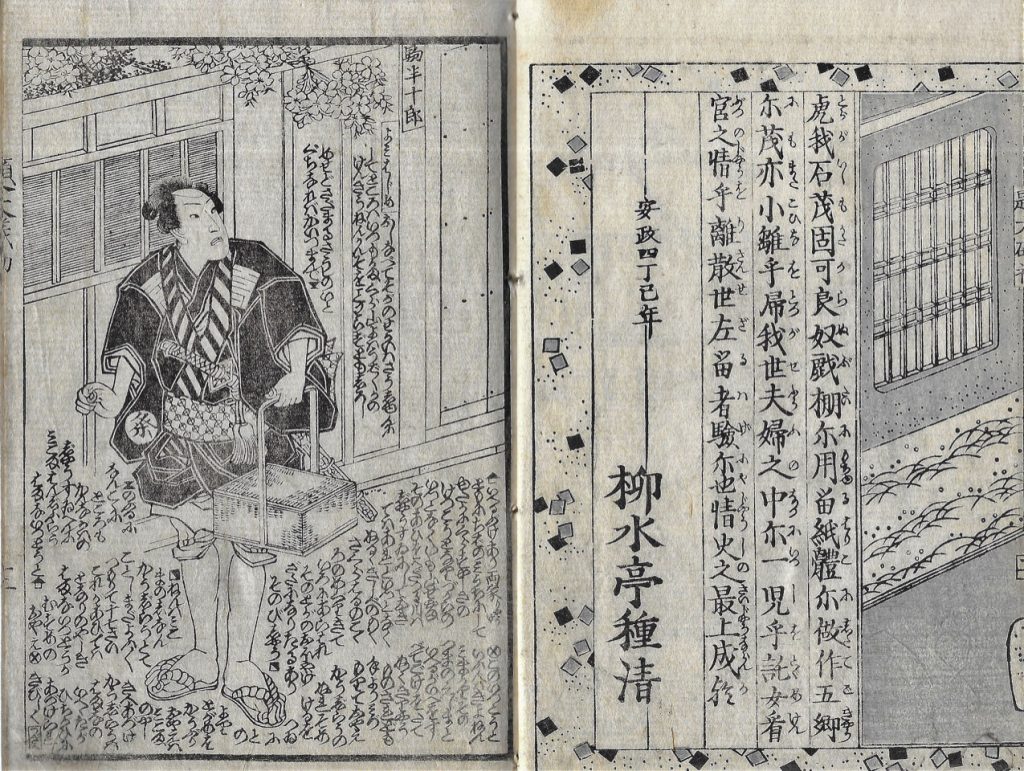
図5は安政4(1857)年に出版された柳水亭種清の『題大磯虎之巻筆』初編上の巻の2丁裏と3丁表の箇所であるが、右側2丁裏には3行に「虎が石も固からぬにるに済五郷にも亦小雛をとつがせ夫婦の中に一児をめの情を離散せざるはにや情史の最上」と、すべて漢字によって記されている。左側3丁表も、デザインされた版面に文字が埋め込まれているといった体で、こうしたことは垂直に均等にわりつけられた行とほぼ同じ大きさの文字を並べることによって可能になるといってよい。
整版印刷においても、こうした版面がつくられていった。矢田勉(2012)は「平仮名横並び」「楷書体漢字と平仮名の共存」「非連綿」を「整版時代」にはみられない特徴としてあげていると思われるが、「楷書体漢字と平仮名の共存」は、図4図5の版面においてもほぼ実現されているといえよう。
図6は「天保六年乙未春正月黄道大吉日發販」という刊記をもつ、『南総里見八犬伝』第9輯巻6の冒頭部分である。天保6年は1835年にあたる。「漢字平仮名交じり」で印刷されており、その漢字はおおむねが楷書体といってよいと思われる。図611行の範囲でいえば、5行目の「門」、6行目の「聞」、8行目の「給」、9行目の「将」が草書体、7行目の「幾」「歟」、10行目の「們」が行書体と思われる。また9行目の「撃」の「手」は草書体のかたちをしている。このことについては、第10回で述べることにしたい。この版面も、(少数行書体、草書体を使ってはいるが)「楷書体漢字と平仮名の共存」といってよいと考える。
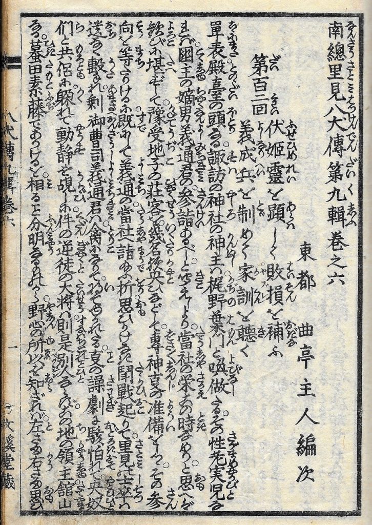
図6ではもう一つ注目しておきたいことがある。それは、「同居」している楷書体漢字と平仮名の大きさである。一見して明らかなように、平仮名は漢字よりも小ぶりになっている。これは楷書体に限らず、漢字と平仮名が「同居」する場合の自然なかたちと推測する。したがって、漢字と平仮名とを同じ大きさで書記することがまずあって、その結果として「平仮名横並び」が実現したという「順」があるのではないか。このことについては、現時点では問題提起にとどめ、今後、ひろく文献にあたっていくことにしたい。
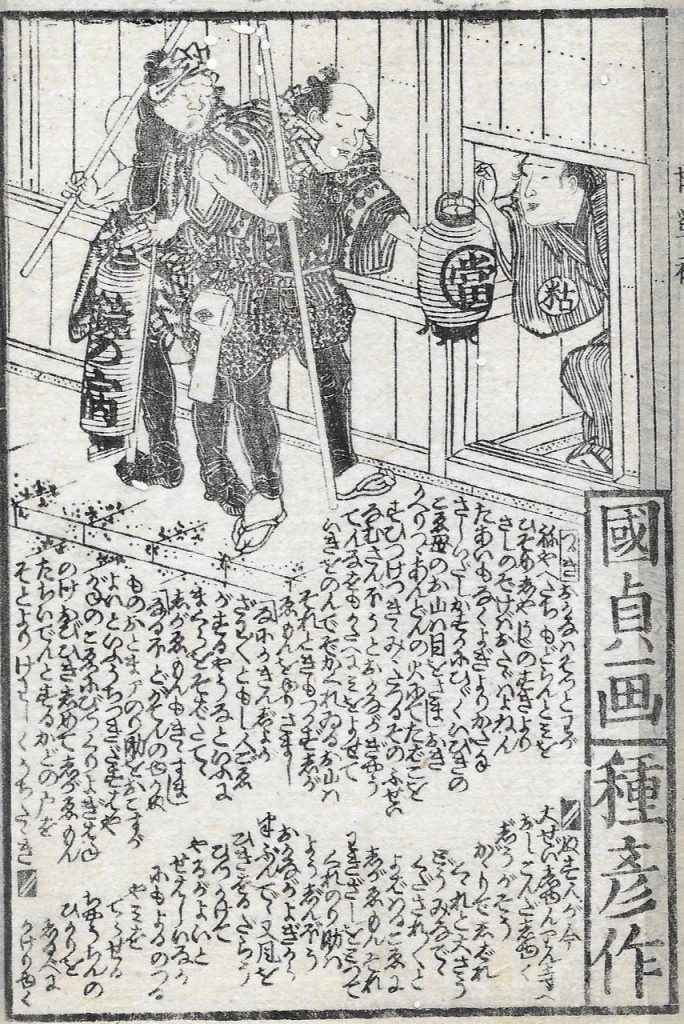
ここで再び『悪狐三国伝』のAに戻りたい。Aは「行書体漢字+平仮名+振仮名」という「表記体」で書記されている。しかし、先に述べたように、1行の文字数がある程度揃っている。行書体漢字であるので、場合によっては漢字と漢字、漢字と平仮名との連綿はされており、平仮名と平仮名との連綿もある。Aにおいても、平仮名は漢字よりも総じて小ぶりに書記されていると思われるが、『南総里見八犬伝』ほどそれが明確ではない。
「行書体漢字+平仮名」という「表記体」は江戸時代においてはさほど特殊な「表記体」ではなかったと推測するが、いつもいつもそれが倉卒な書記のための「表記体」ということではなかったと思われる。「行書体漢字+平仮名」という「表記体」を選択して丁寧に書記するということは当然あったはずで、それがAではないだろうか。
原稿用紙を使うようになった「書き手」、パソコンによって文書を作成する「書き手」にとっては、1行の字数があらかじめ定まっていることは特別なことではない。しかし、1行の字数が一定で、かつ紙面が斉整であるためには、漢字と平仮名の大きさがそれほど異ならないこと、連綿をしないかたちが自然であることがいわば「条件」であった。日本語の歴史を観察するにあたっては、手書きか印刷か、といった文字化の手段に留意することは重要であろう。
註1 矢田勉(2012)は日本の「中世後期から近世にかけて」「規範としての中国文化への依存に揺らぎが生じ、日本に固有的であるものへの自覚が高まってきた」が、「所謂古道を追究すると、つまるところ記紀万葉という純漢字文献に行き着くということ、即ち日本の固有思想は、漢字という中国文化の権化とでもいうべきものをフィルターにしてしか垣間見ることができないというジレンマに陥る。ここに、中国文化・漢字に対する深刻な文字コンプレックスとでもいうべきものが生ずる」(624p)と述べ、「文字コンプレックス」という概念を仮設した上で、「近世の尚古思想が宿命的に突き当たらなければならなかった文字コンプレックスに対して、時代の潮流としては伝説的なものに逃げ道を求め、理性的な解決に至らなかったのに対して、鈴屋は万葉仮名・日本漢字音の科学的研究に基盤を置いたうえで、当代の仮名書記についてその可能性を引き出すという方向を採ったということである。そうした文字意識は、平仮名字体による清濁の書き分けと、平仮名の横並び書記として実践された。次世代の国学者たちには深層としてその文字意識は理解されなかったが、実践された書記様式が引き継がれていく。このうち特に平仮名の横並び書記=平仮名の楷書的用法は、漢字平仮名交り文の活版印刷の基盤整備をいち早く成し遂げたものとして、先駆的意義を持つものである」(634p)と述べている。江戸時代に生きたある人物が、上記のような意味合いでの「文字コンプレックス」を持っていたかどうかを(誰にでもわかるようなかたちで)明らかにすることは難しいことが予想される。また、「そうした文字意識」がなぜ(具体的には)「平仮名字体による清濁の書き分けと、平仮名の横並び書記として実践された」かという説明は必要ではないだろうか。本稿では「文字意識」を措き、「書記様式」のみを話題にする。
参考文献
今野真二 2005 『文献から読み解く日本語の歴史〔鳥瞰・虫瞰〕』(笠間書院)
今野真二 2011 日本語講座第3巻『二つのテキスト(下)明治期の文献』(清文堂)
今野真二 2013 日本語講座第7巻『ボール表紙本』(清文堂)
今野真二 2015 日本語講座第10巻『言語の揺れ』(清文堂)
橋本直紀編 1983 古版本3種『横笛滝口の草子』(和泉書院)
矢田 勉 2012 『国語文字・表記史の研究』(汲古書院)
Last installment looked at the history and principles of orientation and directionality in written Japanese. Today, with very few exceptions, Japanese is written left-to-right in horizontally oriented texts and right-to-left in vertically oriented ones. The topic of this installment is the size of characters and their appearance on the page or screen. The next installment, which focuses on furigana, a fundamental type of interlineal glosses, will be a partial translation of Konno’s important The History of Furigana (『振仮名の歴史』, 2009; 2020) split into two parts.
(Not) Thinking Outside the (Imaginary) Box
Regardless of directional orientation, all characters belonging to the three primary character sets of the Japanese script, i.e., Sinographs, hiragana, and katakana, are written within a single square box of uniform proportion. This box is usually imaginary, though lined writing paper (原稿用紙) intended for vertically oriented texts are regularly used today for a variety of purposes such as writing practice, the writing of manuscripts, and certain school assignments. (The example below of such paper is available to download for free here).
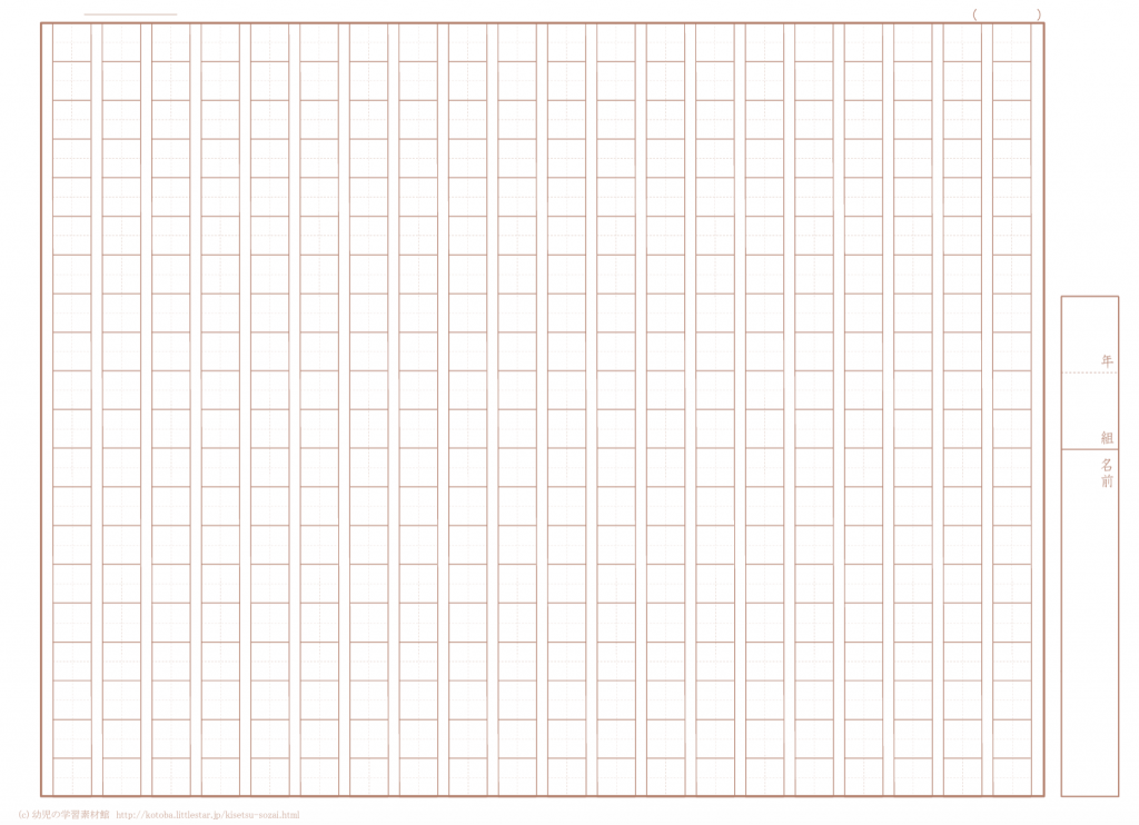
These lined papers are standardized, each containing 20 rows of 20 cells (マス目). The resulting 400 blocks are of uniform size, with all characters and punctuation marks occupying a single cell. There are standard rules surrounding formatting as well as exceptions to the one character, one cell rule: for example, punctuation marks must not come at the beginning of a line and are thus written in the same box as the character occupying a line’s final cell; Latin characters are to be written horizontally with two characters per cell; intertextual glosses (振仮名), the topic of the next installment, appear in a smaller size and to the right of the cell(s) containing the character(s) they gloss.[1]
The existence of these boxes, whether visualized or not, means that all characters composed in such an environment regardless of complexity – “complexity” here referring to the number of strokes used to write a single character – are each allotted a uniform amount of space. More precisely, it is generally true that all characters appearing in contemporary handwritten or printed texts are imagined appearing within, and proportional to, a uniform square box. For example, the following three Sinographs 一 償 䯂, written in one, seventeen, and thirty four strokes, respectively, occupy the same amount of space. The same is true for all hiragana and katakana.
This principle of proportional distribution has a long history. Consider the below inscription on a bronze grain vessel from around the second half of the eleventh century BC.
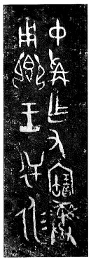
Edward Shaughnessy tells us that “[i]nside the bottom of the basin, an inscription of eleven characters runs from top to bottom in two columns reading right to left: Zhong Cheng zuo you bao yi yong xiang wang ni wei yong[2] [is translated as] ‘Zhong Cheng makes his treasured vessel, to use to feast the king’s reciprocal immortalizing’” (Shaughnessy, 222). Now, it is true that the lines here are uneven: the line on the right contains six Singographs while the line on the left contains five. I do not know why this is the case, but I cannot help seeing what looks like the early stages of a proportional distribution beginning to take shape. The final Sinograph on the right column 簋 clearly occupies more space than, say, the fourth Sinograph of the same line 又; nevertheless, they are similar enough that a general sense of even distribution is not ruined. Let us look at another ancient example: recall the oracle bone inscription cited by Konno in the previous installment.
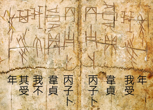
Even here, where exceptions to the invisible box rule abound (e.g., 受, which appears as the bottom character in lines 2 and 8, or 年, which opens and closes the text), we can perhaps see the beginnings of a general recognition of the invisible box.
At times, the invisible box is referred to as a character’s external frame (外枠), and for good reason. It is within the external frame that a centered character appears. In other words, when speaking of a character’s size we are often referring to the size of the character frame within which an enclosed character expands or shrinks in a fixed manner relative to the surrounding frame. This principle is true for both horizontal and vertical text. Though the introduction of characters not belonging to the three primary sets (e.g., characters from the Latin alphabet) complicates things, printed text is overall evenly distributed across the page. Diversions from this norm, on the occasions when they do occur, are usually witnessed in relation to the character frame of a single character or character-string. The historical reasons for this adherence to a principle of proportional distribution is closely associated with developments in Chinese print culture – which is traceable to at least the ninth century[3] – and thus, within the context of early written Japanese, readily witnessed in texts written in literary Sinitic (or in all Sinographs in the case of texts written in ma’yōgana).[4]
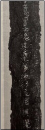
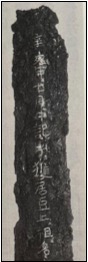
For example, consider the inscription found on the Sakitama-Inariyama sword, which was unearthed in Saitama prefecture in the late 1960s and dated to somewhere between the late fifth to seventh century. Though written entirely in Sinographs, the inscription contains numerous Japanese names, strongly suggesting the inscription was made in Japan.[5] While the content of that inscription is not the focus here, it is relevant that most characters seem to adhere to the principle of proportional distribution. The images below, to be read from left to right, contains the character string 辛亥年七月中記乎獲居臣上祖名 followed by its continuation意富比垝其児多加利足尼其児.[6] Both images are taken from Okimori (2003, 20).
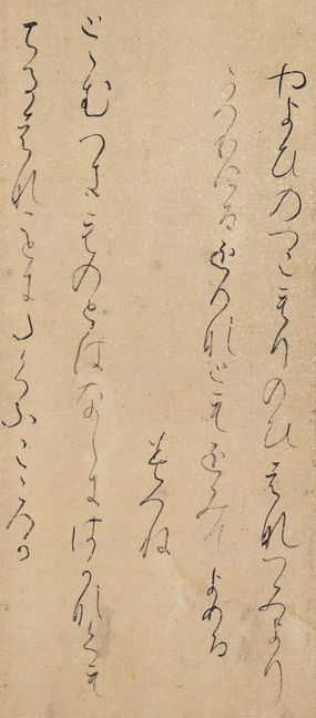
On the other hand, in later texts written in vernacular Japanese and primarily utilizing the hiragana syllabary (e.g., waka, kana zōshi, etc.), the concept of a fixed character distribution is prioritized less than the visual aesthetic of the characters on the page and the way they interact with the characters coming before and after. Consider this page from the 11th century Kōya edition of the Kokin Wakashū.[7] The text is a dynamic one in that one characters shape depends on its context, a context which is ever changing and, at times, left to the discretion of the scribe.
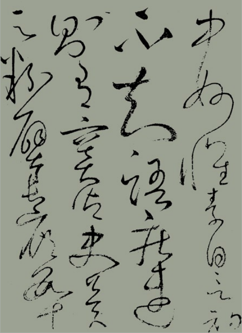
This tradition, too, is witnessed in texts from China: it is related to the Chinese cursive script style (草書) of calligraphy, a mode of expression said to, perhaps unsurprisingly, be capable of representing the emotional state of the writer.[8] As you can see in the image below, it is common for the strokes comprising a single Sinograph to connect with each other. At times, too, the final stroke of one Sinograph serves as the first stroke of another.
Indeed, it is this same cursive script style that served as an intermediary step in the transition from Sinograph to hiragana. Consider, for example, the relationship between the five Sinographs 安 以 宇 衣 於, their cursive forms ![]() , and あいうえお, the first five characters of the hiragana syllabary.
, and あいうえお, the first five characters of the hiragana syllabary.
Size and the Question of Style
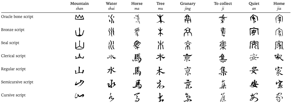
These differences in written styles are just that: styles. The Sinograph 安 is denotatively the same in its cursive form![]() . The hiragana あ, on the other hand, is recognized as a different character simply because we say it is. Understanding that Sinographs can be written in different styles allows us to think about the relationship between the principle of proportional distribution and the invisible box as existing along a spectrum. There are recognized styles of Chinese calligraphy, which calligraphers in Japan also recognize: Oracle Bone Inscriptions (甲骨文字), Bronze Script (金文), Seal Script (篆書), Clerical Script (隷書), Regular script (楷書), Semi-cursive Script (行書), and the Cursive Script (草書), and each one has different expectations regarding equal character distribution. Thomas Höllmann offers the following chart illustrating these different styles (Höllmann 2017, 24).[9]
. The hiragana あ, on the other hand, is recognized as a different character simply because we say it is. Understanding that Sinographs can be written in different styles allows us to think about the relationship between the principle of proportional distribution and the invisible box as existing along a spectrum. There are recognized styles of Chinese calligraphy, which calligraphers in Japan also recognize: Oracle Bone Inscriptions (甲骨文字), Bronze Script (金文), Seal Script (篆書), Clerical Script (隷書), Regular script (楷書), Semi-cursive Script (行書), and the Cursive Script (草書), and each one has different expectations regarding equal character distribution. Thomas Höllmann offers the following chart illustrating these different styles (Höllmann 2017, 24).[9]
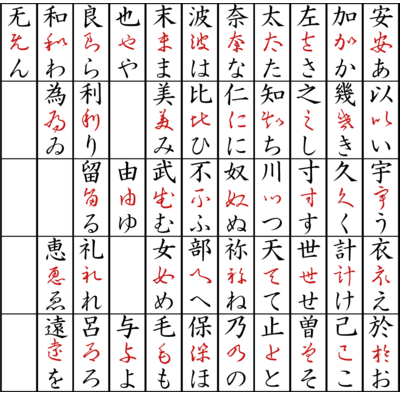
While the Regular Script is what handwriting and printed text in Japan is largely based on, it would be wrong to think different writing styles did not, nor do not, coexist. In fact, it is not wrong to think of the entire set of hiragana as cursived and domesticated Sinographs that now coexist with the very Sinographs they originated from. The chart below provides the standard hiragana set together with the Sinographs they were derived from provided in both the Standard Script and Cursive Script (IMAGE).
To demonstrate what written Japanese would look like if hiragana were written exclusively as the Sinographs from which they were derived, allow me to rewrite the opening line of Hashimoto Osamu’s 1981 Momojiri musume. The first line is the original and, obviously, I hope, the second line is my thought experiment.
大きな声じゃ言えないけど、あたし、この頃お酒っておいしいなって思うの。
大機奈声之也言衣奈以計止、安太之、己乃頃於酒川天於以之以奈川天思宇乃。
No one would do this nor should they. Nevertheless, I provide it here for a few reasons. First, notice that every character on both lines occupy an identical amount of space. Because they are all the same font and size – MS Mincho 12 – they are all surrounded by the same invisible box. Second, I note that line two is a text adhering to the principles of man’yōgana, the ancient method of writing Japanese I discussed earlier that represents Japanese words phonetically vis-a-vis Sinographs. Replacing Sinographs with hiragana makes the text far easier to read and vice versa. Finally, notice how the text has domesticated the highly cursived Sinographs by removing them from their cursive context and transforming them into completely new characters. One step in the process of domestication was making sure they, too, adhered to the principle of proportional distribution.
In summation, then, one key to understanding the architecture of written Japanese is to understand its relationship to the architecture of written Chinese – which may lead us, perhaps, to begin conceptualizing an even larger architecture of the Sinographosphere – and, here specifically, the application of the principle of proportional distribution, a rule that is applied more or less depending on which style one is writing in. A style will usually be consistent throughout a text, and formal texts are almost always written in a style that adheres to said principle, whether handwritten or printed. Printed texts almost universally adhere to this principle. It is also my guess that most written texts today stick close to this principle except for, for example, skilled writers and calligraphers writing in an epistolary style or practicing calligraphy. The complex relationship between medium (paper, computer, etc.) and style (Cursive, Regular, etc.) is something I hope to explore in more detail at a later date.
Works Cited
Cheng Tingyou, trans. Ren Lingjuan. Chinese Calligraphy, China International Press 2003.
Edgren, J.S. “China” in A Companion to the History of the Book, Wiley-Blackwell 2007.
Höllmann, Thomas O. Chinese Script: History, Characters, Calligraphy, Columbia University Press 2017.
Lurie, David. Realms of Literacy: Early Japan and the History of Writing, Harvard University Asia Center 2011.
Okimori Takuya. Nihongo no tanjō: kodai no moji to hyōki, Yoshikawa Kobunkan 2003.
Shaughnessy, Edward L. “The Beginnings of Writing in China” in Visible Language: Inventions of Writing in the Middle East and Beyond, Oriental Institute of the University of Chicago 2010.
[1] Though much more ought to be said about the cultural history of lined paper, including its usage outside of Japan, Wikipedia offers a good summation of the history of, and rules governing, them.
[2] The corresponding Sinographs are 仲爯作又寶簋用鄉王逆X, with X being a Sinograph no longer in use. I also note that some sources offer the Sinograph 彝 in place of 簋, though that debate is beyond the scope of the current discussion.
[3] See for example Edgren (2007. 103-4).
[4] And yet even this is not a hard rule. Consider, for example, the copy of the Man’yōshū known as the Kanazawa Manyō 金沢万葉 in which the text most closely resembles a cursive style, something I discuss shortly.
[5] For a discussion of this sword and others, see Lurie (2011, 91-99).
[6] The “Japanese” of the text, by the way, includes the phonetic representation of names like Wowake as 乎獲居, the method of representing the Japanese language vis-a-vis Sinographs called man’yōgana.
[7] Kōya edition, volume 20th , one handscroll, 25.5cm, 2.6m long (total). ink on mica decorated paper, About ACE 1050, Heian period, in Kochi Tosa Yamauchi Family Treasury and Archives, Kochi, Japan.
高野切 第二十巻, 山内家宝物資料館、高知.
[8] The topic of calligraphy is beyond the scope of this serialization. Though one can point to a myriad of texts discussing Chinese calligraphy, I refer to the text sitting on my bookshelf: Ren Lingjuan’s English translation of Chen Tingyou’s (陈廷祐) Chinese Calligraphy (2003), especially pages 65 – 78 in regard to the expressive function of calligraphy.
[9] The degree to which these scripts are used today vary widely, from not at all to regularly.
