今野真二
表題の「漢字体系」は言い換えれば「文字体系として捉えた漢字」ということで、通常の文字体系は記号の体系として「閉じている」ということを前提としているが、それに対して「漢字体系」は拡張することができ、開放されている、すなわち、体系として「閉じていない」とみることができるのではないか、ということが今回の話題である。
まず記号体系が「閉じている」ということについて簡単に述べておくことにする。「あらわされる内容」があって、それを「あらわす記号」があるということがもっとも簡略な「記号」の定義といってよいだろう。交通信号を使って説明する。車にも人にも「進め(go)」と「とまれ(stop)」という2つのアクション=「あらわされる内容」がある。その2つのアクションを「緑色の信号」と「赤色の信号」とで示す。「あらわされる内容」が2つで「あらわす記号」が緑色と赤色との2色であるので、「内容」と「記号」とが1対1の対応をしている。ある日突然、緑色と赤色の他に紫色が増えていた、というようなことはない。もしも紫色を増やすのであれば、それに対応するアクションがなければならない。信号に緑色と赤色の他に黄色がある信号がある。「道路交通法施工令」第2条には「黄色の灯火」について「歩行者は、道路の横断を始めてはならず、また、道路を横断している歩行者は、すみやかに、その横断を終わるか、又は横断をやめて引き返さなければならないこと」、「車両及び路面電車(以下この表において「車両等」という。)は、停止位置をこえて進行してはならないこと。 ただし、黄色の灯火の信号が表示された時において当該停止位置に近接しているため安全に停止することができない場合を除く」とあって、基本的には歩行者も車両も進んではいけないことになっている。歩行者が横断歩道をわたり始めた時には信号が緑であったが、わたり終わる前にいきなり赤になってしまうと歩行者は信号が赤になっても横断歩道をわたっていたことになってしまう。つまり、アクションの遂行に時間がかかることに対しての対応が黄色信号であろう。そのことを考え併せると、記号的な意味としては、「赤色・黄色」は「とまれ」で「緑色」のみが「進め」ということになる。2つのアクションに対して、色グループが2つ設定されていることになり、やはり記号体系といってよいが、黄色信号の意味がきちんと共有されていない可能性はあるだろう。
さて、中国語における漢字は原則として表語文字として機能している。ということは、語が新しく生まれたらその語をあらわす漢字も新しくつくる必要がある。それを可能にするためには、漢字を新しく生み出すことができるようになっていなければならない。漢字はそもそもそういう「閉じていない」文字体系であった。
漢字の字形の構成と用法に関する6つの原則、象形・指事・会意・形声・転注・仮借(かしゃ)を「六書」と呼ぶことがある。「象形・指事・会意・形声」が字形の構成=造字法についての4つである。「象形」は物のかたちをかたどったもので、「日」「月」などがあたる。「指事」はことがらをかたどったもの、「会意」は「象形」の字と「指事」の字を合わせて新しい意味をあらわす別の字をつくる(注1)。 「形声」は漢字のある部分を発音の記号(=声符)、ある部分を意味の記号(=意符・義符)として当該漢字全体の発音と字義を導き出す。例えば、「可」と「氵」とを合わせて「河」とするような類を指す。「形声」によって作られた漢字は多い。「声符+義符」によって1つの漢字をつくりだす「形声」という漢字生成システムがあることによって、漢字は「閉じていない」体系であることができた。またこのことは、「声符」と「義符」とが漢字を形づくる構成要素(パーツ)として動く、すなわち「動的にふるまう」ことを許しており、漢字の体系が「閉じていない体系」であることを積極的に保証しているとみることもできる。
日本で出版されている『大漢和辞典』はおよそ5万字を収めている。漢字は表語文字なので、5万字で5万語をあらわしていることになる。仮に日常生活に必要な語が10万語程度あるとしたら、5万字ではまかないきれない。あと5万字が必要になる。漢字は上記のように、「閉じていない=開かれた文字体系」であるから、その気になればさらに5万字をつくることはできる。しかし、すでに5万字ある上にさらに5万字をつくるとなれば、画数が多い字を作ったり、微妙な違いによってX字とY字とを区別するというようなことをしなければならない。そういうことから(かどうかはわからないといわざるをえないが)、結局中国語においては、漢字1字で1語と対応しているシステムを貫くのではなく、漢字2字で1語をあらわすようになった。2字熟語と呼ばれるものがそれにあたる。漢字2字で1語をあらわすのだから、そのように使われている漢字は2字で1語をあらわしており、2字の1字がそれぞれ表語していないことになる。このような場合の漢字は表意文字として機能しているということになる。しかしそれでも、中国語においては、多くの場合、漢字1字が1語をあらわしているので、中国語をあらわす文字として使われている漢字は表語文字として機能しているとみることにする。
さて、「形声」という造字方法は現在でも有効であるのだから、漢字を増やしていくことはできなくはない。しかし、必ずしも漢字を増やし続けているわけではないと思われ、そうであれば、漢字は「閉じていない」文字体系であるのに、結局「閉じた」文字体系にちかいものになっているとみることもできる。しかしまた、現代において「漢字をつくってみましょう」というようなことはあり、漢字をつくることはでき、結局漢字は「閉じられていない」とみることもできる。
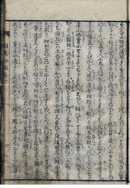
ここでは少し異なる観点から記号体系としての漢字について述べてみたい。図1は滝沢馬琴『朝夷巡嶋記全伝(あさいなしまめぐりのきぜんでん)』巻1初輯第1の19丁表、図2は21丁表の箇所にあたる。『朝夷巡嶋記全伝』は初編から六編が文化2(1815)年から文政10(1827)年にかけて出版されている。
図1の1行目と2行目、図2の1行目と2行目とを振仮名を省いて翻字する。「栞*」の箇所には「草冠+栞」の形の字が使われている。この「栞*」はおそらく『大漢和辞典』に載せられていないし、『康熙字典』にも載せられていない。
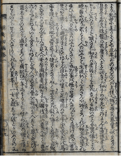
より。乳母に参りてはや三年。その義をいへば主従也。誠を推せは恩愛の奴となりて
旦暮に。掌の珠。翳しの花。塵さへすえず孚し。和子の必死を外に見よ。連係せられ
給ふなよ。物成後をよくも見ず。もし佻々しく洩しなば。われはそなたを憾なん。努
秘てよ。と説示せば。栞*手は目を拭ひ。御こゝろやすく思召せ。良人にもそのこゝろ
図をみればわかるが、『朝夷巡嶋記全伝』は「漢字平仮名交じり」の表記体で印刷されている。漢字の字体に着目するならば、楷書体を基調とし、そこに行書体と少数の草書体を混ぜ用いている(注2)。例えば、1行目の「乳母」はほぼ楷書体、「参りて」の「参」は行書体、「主従也」の「也」は草書体とみることができる。他に5行目に3回使われている「給」、7行目の「聞」、9行目の「呼」・「為」などが草書体で印刷されている。
稿者は「表記体」を「日本語をどのように文字化しているか」という概念としてとらえているが、その「どのように」はおもに漢字、仮名(片仮名・平仮名)をどのように使うか、という文字種を観点としてとらえることになる。しかし、漢字に関しては、(場合によっては、と述べておくが)「楷書体」「行書体」「草書体」がどのように使われているか、という観点も必要になると考える。
2行目の「掌」には「たなそこ」という振仮名が施されているが、「掌」の「手」の部分は楷書体ではなく、草書体になっている。つまりここにみられる「掌」は「手」の部分は草書体、それ以外の部分は楷書体で、「楷書体+草書体」といういわばハイブリッド書体をしていることになる。図2の2行目の「手」は草書体で記されており、「手」は単独でも、漢字の構成要素(パーツ)として使われても、草書体の形を採っていることが確認できる。1つの漢字について「楷書体」「行書体」「草書体」という「書体」があるとみるのがこれまでのみかたで、そうみた場合、100の漢字に対して、それぞれの書体が100あるということになる。しかし、「形声」を原理としてつくられている漢字のように、構成要素がはっきりしている場合、その構成要素の1つが「楷書体」、1つが「草書体」で実現してもよい、ということになれば、少なくとも視覚的には異なる漢字が多数存在できることになる。ハイブリッド書体の存在は漢字の「書体」概念の再検討を促す可能性もある。内田久美子(2020)は「左」と「ヒ左」(『大漢和辞典』補巻が114pにおいて「補57」の番号を与えている字で「左」の「工」の部分が「ヒ」のような形になっている字。便宜的に「ヒ左」と呼び、表示する)に関して、「「佐」のように同じパーツを持つ別の漢字に対しても見られることが『太政官日誌』の中で確認できる」(116(229)p)と述べている。『大漢和辞典』補巻は「補57」に関して、『類聚名義抄』の記事を示している。12世紀後半には成っていたと推測されている観智院本『類聚名義抄』仏上45丁裏8行目には「ヒ左 左 右」と3字が掲出され、続く46丁表1行目には「ヒ左右」が見出しとして掲出されている。「左」には和訓も置かれておらず、「語釈」がない。「トニカクニ」という和訓を配されている「ヒ左右」においても「左」ではなく「ヒ左」が使われていることからすれば、少なくとも観智院本においては(と述べておくが)「ヒ左」が標準的な形とみなされていた可能性がたかい。ちなみにいえば、『康熙字典』は「左」を見出しとし、「ヒ左」は『康熙字典』に載せられていない。「ヒ左」は、「左」の2画目にあたる斜め縦画に「工」の部分の1画目の左側があまりない形が接触している形で、「漢字字体規範史データベース」に依ると、「s81」(s81大般若経巻11:506年)にそうした形がみられることがわかる。「工」の3画目の横棒の左側もあまりなくなると「工」が「ヒ」にちかづく。そうした形が『阿毘達磨大毘婆沙論』巻178(8世紀初)に使われていることがわかる。これらは中国の写本における使用ということになる。日本においては、『高山寺本大教王教』巻1(815年)あるいは『金剛大教王経』巻2(12世紀初)兼方本『日本書紀』巻2(1286年)に使われていることがわかる。したがって、中国においても、日本においても写本で「ヒ左」が使われていたことが確認できる。このことを「中国においても、日本においても」と括ると、異なる空間で「ヒ左」が使われていたとみることになる。ただし、「漢字字体規範史データベース」によって確認できることは、「使われていたかどうか」までであって、「同じように」使われていたかどうかは、使われていたテキストを中心として、共時的にどうであったかを確認するしかない。「左」は5画の字で、筆画は比較的単純といってよい。そうした単純な筆画から成る漢字を筆で書く場合に、中国と日本とで、まったく没交渉に同じような形がうまれる可能性は否定できない。現代日本語においては「左」を使っており、その現代日本語母語話者の「心性」では「ヒ左」が少し変わった字に見えたとしても、だからといって、それが中国で生まれて日本に伝わった特殊な字形であるという推測をすることは(推測であるのでしてはいけないということはないが)、飛躍的推測といわざるをえない。しかしまた、そうしたことがないともいえない。
結局、中国において表語文字として使われている漢字を、日本語においても使っているということにいわば「戻る」ことになるが、中国において使われている漢字と日本において使われている漢字は「同じ」ものとみなせるのか、という問いが根底にはあることになる。
そして、その場で消えていく「音声言語」を時空を超えて残すためにうみだされた文字は、その使命通りに時空を超えて残り、蓄積されていく。漢字の場合は、それが表語文字・表意文字で、意味を喚起することができるということによって、「事態」はさらに複雑になっていると思われる。
図3は手習いの学習をする子どもが漢字を覚えるための教科書として編まれたと考えられている『小野篁歌字尽(おののたかむらうたじづくし)』というテキストのパロディとしてつくられたと思われる『小野AB字尽(おののばかむらうそじづくし)』(Aは「竹+愚」Bは「言×虚」)。小野篁をもじって、「皇」を「愚」と置き換えている。このタイトルがすでにパロディで、それが漢字にも及んでいる。
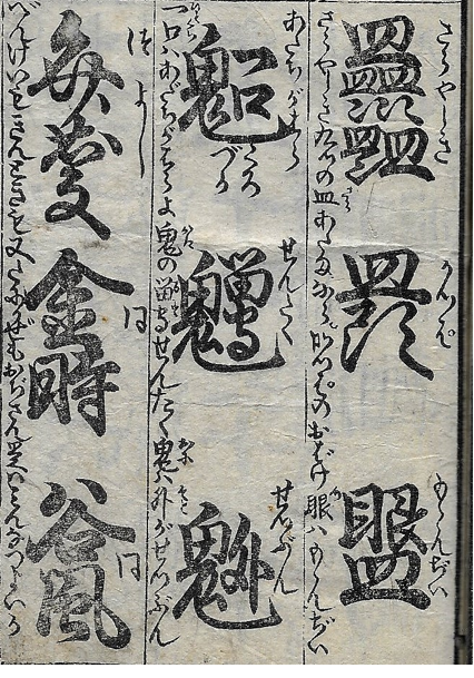
図の1行目では「皿」を構成要素として、それを9つ重ねた形が示されている。まず「皿」があって、その下に「皿」が2つ、その下は、「澁」を「渋」といわば略す場合に使われる「チョンチョン」が3つあるので、そこに「皿」が3つあり、その下の左側は「皿」の下にやはり「チョン」があって、そこに「皿」が1つで、合計9つの「皿」ということになる。いわゆる「番町皿屋敷」になぞらえた造字であろう。その下は「皿+頭」で、頭の上に皿があるからかっぱ、その下は「眼+皿」で「ももんぢい」。目や口などを指で広げてこわい顔、変な顔をして子供をおどしたり、なだめたりする時に「モモンジイ」「モモンガア」と言うことがあり、それをふまえた造字であろう。左側には「さらやしき九つの皿、あたまならかつぱのおどけ、眼はもゝんぢい」と記されている。(読点を適宜補った)
2行目は左側に「一口はあだちがはらよ、鬼の留守にせんたく、鬼は外がせつぶん」と記されている。「鬼×(一+口)」の字の下に「くろづか」とあることからわかるように、能の「黒塚」をふまえた造字で、「鬼×(留+守)」で「せんたく」、「鬼×外」で「せつぶん」はわかりやすい造字といってよい。こうした文字遊びも、漢字体系が閉じていないことによって可能となる。
『小野AB字尽』は「おもしろさ」のために新たな文字をつくりだしているが、パロディを表現ととらえれば、中国・日本のいついかなる時期においても、漢字体系の拡張性・開放性に依拠した文学表現がうみだされる可能性がある。日本製の漢字、すなわち「国字」は、必要があってうみだされたものといえるだろうが、いずれにしても漢字体系の拡張性・開放性を背景に、新たに漢字をうみだすことが可能になっていることには留意しておきたい。
9世紀末頃に「仮名」がうみだされた。片仮名は漢字の部分を採ることによって、平仮名は漢字全体を曲線的に変形させることによって、漢字とは別の文字体系となった。仮名はそれぞれの文字体系内で、微調整を繰り返して、次第に体系を整えていったと思われる。しかし、明治33(1900)年の「改正小学校令」によって小学校で教育する仮名字体が1つに絞られるまでは、複数の仮名字体を使い続けた。佐藤栄作(2018)は「仮名は、成立後も漢字(「仮名漢字」)からの「補給」がなされた。それによって、仮名は、枠があるにも関わらず、一枠一字体を達成できなかった(しなかった)。「補給」は、ある時点までと時間を区切れるものではなく、理論上、常に可能である」(54p)と述べている(注3)。つまり、人為的なとりきめによって仮名は1字体に収斂することができた。江戸時代の国学者の著作物をみていると、室町時代までにはあまり使われていなかったと思われる平仮名を見出すことがある。国学者は漢字をもとにして平仮名がうみだされたことを知っているから、自身の好みに応じて(と表現しておくが)、漢字をもとにして新たな平仮名をつくることができる。仮名は漢字体系を背景にして、なかなか「閉じた小さな体系」にならなかった。今回は「漢字体系の拡張性・開放性」を話題にしているが、「仮名体系」もまた近時まで「拡張性・開放性」を備えていたことには同時に注目しておきたい。
注1 「新しい意味をあらわす別の字をつくる」と述べると、文字が意味をもっていることになってしまうが、「新しい語義をもった新しい語をあらわす別の字をつくる」と表現するのが厳密な表現になる。文字は意味=語義をもたない。
注2 「楷書体・行書体・草書体」を厳密に定義することは難しいので、ここでは漢字の筆画がそれぞれ独立し、はっきりしていて画数を数えることができるような字体を楷書体、漢字の筆画が連続している箇所があって、画数が数えにくいような字体を行書体、ほとんど一筆で書けるような形になっているものを草書体と、ごく簡略に定義しておく。
注3 「仮名漢字」は日本語の音節をあらわす音節文字として漢字を使う場合に、そのように使われた漢字は「仮名」ではなく「漢字」の用法であることを示すために使われている用語。
参考文献
今野真二 2017 『図説 日本の文字』(河出書房新社)
佐藤栄作 2018 「仮名であることと「秋萩帖」」(勉誠出版『秋萩帖の総合的研究』所収)
内田久美子 2020 「『[校正/増補]漢語字類』「目次」欄上の組の漢字字形の位置づけ- 『太政官日誌』との対照を通して-」(和泉書院刊『国語語彙史の研究』39所収)
The Architecture of Written Japanese
12 Sinographs as an Open Character Set
Chris Lowy
This installment discusses the final element of the architecture of written Japanese: Sinographs as an open character set. Perhaps not as common as the other elements I’ve hereto examined – furigana, for example, or the principle of interchangeability – Sinographs as an open set helps us understand how authors writing in Japanese engage with Sinographs, kana, foreign scripts, and emoji. It also allows us to approach two deceivingly complicated questions: (i) how many Sinographs exist, and (ii) what are the boundaries between the Sinographs used in Chinese and Japanese (and any host of written languages)? To understand the features of an “open character set” it will be helpful to first look at a “closed character set,” in this case, the Latin alphabet.
Alphabets as Closed Character Sets
Alphabets are generally stable entities. While the relationship between how something is spelled (its visual representation) and how it is read aloud is tenuous, in the contemporary world the letters used to write those spellings do not change. Because the Western linguistic tradition generally views signification occurring at a dimension removed from the visual representation of language (i.e., signification occurs at the level of aurality),[1] alphabets (and abjads such as Hebrew and Arabic) themselves are not viewed as a space for creative expression.[2] Even when old alphabets are modified (e.g., Latin into Czech) or new alphabets are created (e.g., Adlam), the goal is to represent phonemes not contained in the original or otherwise visually represent a language more efficiently. The story of the Latin alphabet, as is everything, is a long one with many detours and side adventures. Let’s go down one such path, if even for just a moment.
The Latin alphabet we use today, which evolved out of Etruscan which itself developed out of Euboean Greek, is clearly related to other alphabets in use today. And all these alphabets are derivatives of the Phoenician script. These connections, which culture and aesthetics often obscure, have been known for a long time. For example, Evangelinos Apostolides Sophocles (1804-1883) opens his landmark History of the Greek Alphabet and of the Pronunciation of Greek (1848) with this observation.
The original Greek alphabet was the same as the Phœnician or Shemitic [Semitic]. This proposition is established in the following manner:
First, The Greek letters used in the most ancient inscriptions are, as to form, essentially the same as the corresponding characters found in Phœnician inscriptions and on Hebrew coins.
Secondly, The relative position of nearly all the letters in the two alphabets is the same.
Thirdly, The names of the Greek letters are radically the same as those of the corresponding Shemitic letters.
The arrangement of the Shemitic letters is determined by the alphabetical compositions in the Old Testament; the “Lamentations,” for instance. The Greek letters are found arranged alphabetically on a very ancient Etruscan vase, made before the introduction of Ω. Thus, A B Γ Δ E F Z H Θ I K Λ M N Ξ O Π Q P Σ T Υ X Φ Ψ, where X stands before Φ.[3]
The oldest Greek inscriptions are written in letters with Phoenician and Semitic correspondences,[4] were ordered in nearly the same way (i.e., alpha-beta-gamma and alef-bet-gimmel), and shared letter names (i.e., alpha/alef, beta/bet, gamma/gimel). And as for the ordering of the alphabet itself? According to Reinhard Lehman, “With the destruction of Ugarit [modern-day Ras Al Shamra in Syria] at the beginning of the twelfth century BCE the Ugaritic cuneiform alphabet tradition came to a sudden end. But the Abgad [the “ABCs”] order that formed its dominant arrangement device […] survived as the basic order of most Western and Semitic alphabets until today.”[5] The Greek ordering noted by Sophocles was itself inherited from Ugaritic cuneiform. Image 01 shows the relationship between Greek and Phoenician, while Image 02 shows the relationship between Phoenician and the Semitic scripts.
This is not to say that the Latin alphabet is the same as the Greek alphabet is the same as the Hebrew alphabet. Each of these scripts have different histories and traditions – “stories” – that disambiguate themselves from each other in real and meaningful ways. They are mutually unintelligible without special training and operate under varying architectures of script. My point is that alphabets (or abjads, etc.), once settled, are rarely the target of creative expression. They constitute, in this context, a closed character set. This means that within a given architecture of script (e.g., English vis-à-vis the Latin alphabet or Hebrew vis-à-vis the Hebrew alphabet) the basic tools for visually representing language are set with innovation occurring at the level of content. In contrast to the “closed” nature of the alphabet, the Japanese writing system, and Sinographs specifically, might be considered “open.”
Sinographs – An Open Character Set?
As discussed in the third installment of this series, Sinographs 漢字 are thought to have reached Japan via the Korean Peninsula around the fifth century. Literary Sinitic 漢文, which was written in Sinographs, was the literary and administrative (written) language of East Asia until the modern period. Given its cosmopolitan nature, one that can (or at least seem to) transcend spoken language,[6] the parameters of the term “Sinograph” are difficult to pin down. That is, does the term “Sinograph” refer to the entire set of Sinographs used throughout the “Sinographosphere” (漢字文化圏) or to the subset of Sinographs used in a given locality (e.g., China, Japan, or Korea)? The subjective nature of categorization prevents one from easily answering this question. Should, for example, allographs (i.e., variant character forms) such as者 and 者 be counted as individual characters? What about simplified forms of traditional Sinographs such as 龙 and 竜 for 龍? Or, what about characters whose meaning and reading(s) are unknown or have otherwise been lost to time but are nevertheless recorded in Sinograph dictionaries (e.g., 彁)? Such complications are one reason why, in this essay series, I refer to 漢字 collectively as Sinographs and not kanji (its Japanese reading), hanzi (its Chinese reading), hanja (its Korean reading), or Hán tự (its Vietnamese reading). My argument, as it relates to written Japanese, is perhaps even more radical: that the architecture of written Japanese makes it impossible to determine with certainty what is or is not a Sinograph. That is, the architecture of written Japanese allows the character set collectively referred to as Sinographs to function as an open set, a set whose parameters are impossible or else difficult to define.
From “Sinograph” to “Sinograph-like”
I know, I know, let me get this out of the way: I am not claiming Sinographs do not exist. Rather, I am claiming that the concept of the Sinograph as it is used in Japanese can also be applied to characters that act like Sinographs. They are a character or character-string on the base text onto which furigana can be attached. Consider Image 03, an advertisement put out by Mister Donuts some years ago.
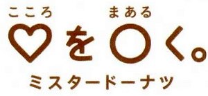
This sentence, read kokoro o maaruku, is undoubtably Japanese: an object (kokoro) is followed by the direct object marker (o), a change of state is indicated (maaruku), the end of the sentence is signaled by a period, and every character is readable. And yet, despite my best efforts, I could not locate ♡ in any dictionary of Sinographs. 〇, on the other hand, is a little more complicated. Though not generally recognized as a Sinograph, it has the readings zero and rei, both indicating the numeral zero, associated with it.[7] Nevertheless, this advertisement is clearly composed of Sinograph-like characters that have been assigned the readings kokoro (n., “heart”) and maaru[ku] (implied v., “to [make] round”), respectively. Make your heart round: a pleasurable emotional state achieved by eating donuts. Extreme though it may seem, one encounters such Sinograph-like characters more than you might imagine.
There are countless examples of non-Japanese character sets appearing in the base text and functioning like Sinographs. This is frequently encountered in so-called Zainichi Korean literature.[8] Image 04 is a section from Lee Yangji’s 李良枝 novel Yuhi 由熙. Yuhi, which follows the titular protagonist as she studies abroad in Seoul, is the story of a young woman struggling to come to terms with an identity that straddles not only nations and cultures, but also languages. In the following scene Yuhi is in her room, drunk and alone, when her host sister enters and is shocked by what she sees.
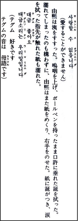
사랑 할 수 없습니다 Sarang hal su ŏpsŭmnida I can’t love it.
Yuhi sniffed and continued sobbing. Pen still in hand, she wiped a bit of saliva that had been hanging from the corner of her mouth. Not caring that her hand was now wet, she flipped to yet another page and started writing again. The tears and saliva she had wiped from her face with her fingers soaked into the page where her hand rested.
대금 좋아요 Taegŭm chohayo I like the taegŭm.
대금소리는 Taegŭm sori nŭn The sound of the taegŭm
우리말입니다 urimal imnida is our language.[9]
If the sudden appearance of Hangul (e.g., 사랑 할 수 없습니다) seems, well, queer, that is the point. How to represent the psychological state, the trauma, of a character straddling two cultures and two languages is resolved here through the imposition of a foreign script. In this case, like the ♡ discussed earlier, the various character-strings written in Hangul function as Sinograph-like characters. This practice isn’t limited to Zainichi Korean authors.
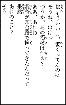
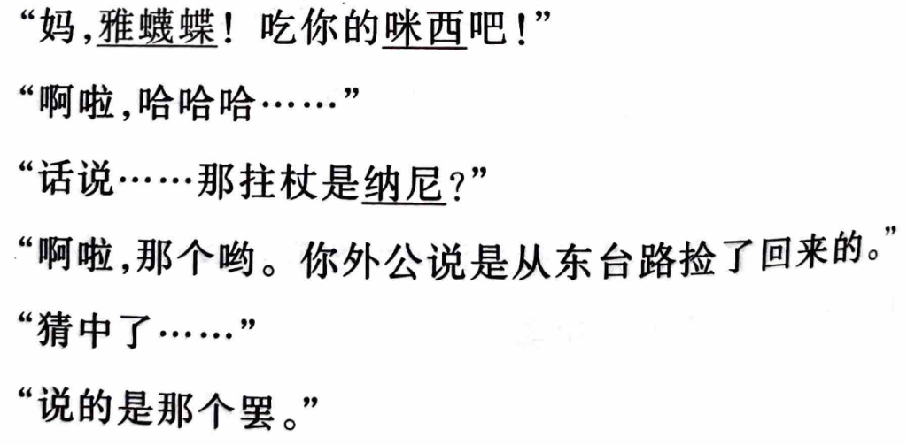
Image 05 is a section from Yokoyama Yūta’s 横山悠太 2015 Wagahai wa neko ni naru
吾輩ハ猫ニナル (I Will Become a Cat). Like Yuhi, Yokoyama’s text describes a protagonist struggling with an identity that straddles two nations, two cultures, two languages, and two scripts. Here, even more so than in Yuhi, this “biscriptal” identity is manifested in the text itself. For readers of Japanese, the effect is jarring: the language is Japanese, but the Sinographs are both Chinese in form (i.e., 饭 where 飯 is expected) and lexicon (e.g., 捡where 拾 is expected). Image 06, on the other hand, is the Chinese translation of the same section I include it here to highlight one point: while the architecture of written Japanese can accommodate (into the base text) a variety of scripts (including simplified Chinese), the Chinese translation of Yokoyama’s text indicates Japanese words not through character choice (纳尼 for nani, i.e., 何) but by underlining those same characters. The significance of these various script practices, in other words, the creation of these various text-worlds, is not only important to understand the text, it is the text. Lee and Yokoyama, radical though they may seem, are operating within a long tradition. Let’s now turn our attention to some historical precedents for their script practice.
Sinographs: Never a Closed Set
Konno’s piece discusses a text from the Edo period by the famous author of comic literature (gesaku) Shikitei Sanba (1776-1822). The text in question, a parody of the earlier Ono no Takamura utajizukushi 小野篁歌字尽 (late 18th century, author unknown), is titled Ono no Bakamura usojizukushi 小野 譃字尽 (1806). If the third Sinograph (a combination of 竹, 禺, and 心禺禺竹竹) looks out of proportion, this is because the character does not exist outside of this particular text. It was the invention of Sanba, and is currently not capable of being typed. The original text is a guide to help students remember Sinographs and other characters. In Sanba’s parody, Ono no Takamura, the name of a Heian period poet, becomes Ono no Bakamura, baka meaning “fool.” Utajizukushi, referring to the process of memorizing characters through song, has been changed to usojizukushi, with uso meaning “lie; fake, false.” Again I ask: how is this different from the ♡ discussed earlier? Sanba’s invented character might look more like a Sinograph, but that doesn’t make it any more real. And Sanba’s experiments were not all that unique. The act of creating new Sinograph-like characters can be found in many manuscripts from the Edo period manuscripts.
For another, let’s look at even earlier Haikai hitotsuboshi 俳諧一星 (1685).[10] Edited by Kishimoto Chōwa 岸本調和 (1638 – 1715), this collection of poetry is from the Japanese/Chinese haikai (和漢俳諧) tradition. Image 07 is a pair of poems by two poets called Suiken 水軒 and Shikei 紫笄.
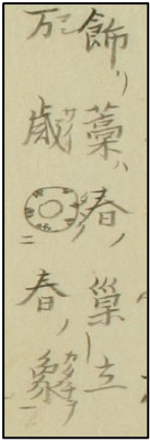
| Base Text | Reading | Translation |
| 飾藁春巣立 | 飾リ藁ハ春ノ巢立 kazariwara wa haru no sudachi | Decorative straw [means] Leaving the nest in the New Year |
| 万歳 春象 | 万歳春ノ象ヲ  [タタ]ク manzai haru no katachi o tataku [タタ]ク manzai haru no katachi o tataku | The manzai dance: drum the shape of the New Year! |
The vocabulary of the first verse, namely kazariwara, or “decorative straw,” refers to the lunar New Year as it would be hung at the entrance or inside of a home during the season. Straw reminds one of birds, and thus the image of young chicks leaving the nest is evoked. Then, in the second verse, we are told that the shape (katachi 象) of the New Year is celebrated with the sounds of manzai.[11]
There is a complex self-reference in line two: the “shape” of the New Year, namely the waist-drum, or the “shape of the New Year” one would expect to accompany the sounds of the manzai, actually appear in the poem as . We are instructed to read this (again!) unfamiliar Sinograph-like character as tataku, a verb meaning “to drum; to beat.” We can say that is functionally indistinguishable from any other character in this manuscript.
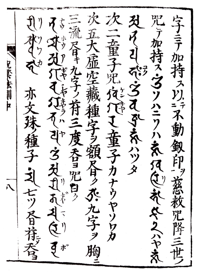
Lest you think literature an exception, we find such characters is another, more serious space: curses, spells, and protective charms. Image 08, from the nearly contemporaneous Jakyō jugon hossoku 邪兇咒禁法則 (1684), provides both a spell for general protection and a charm to vanquish illness. None of the twenty Sinograph-like characters with the 鬼 (spirit; demon) semantic classifier are, well, “real” Sinographs. This is especially true of the ones that contain Sanskrit characters, stars, or the Buddhis symbol 卍![12]
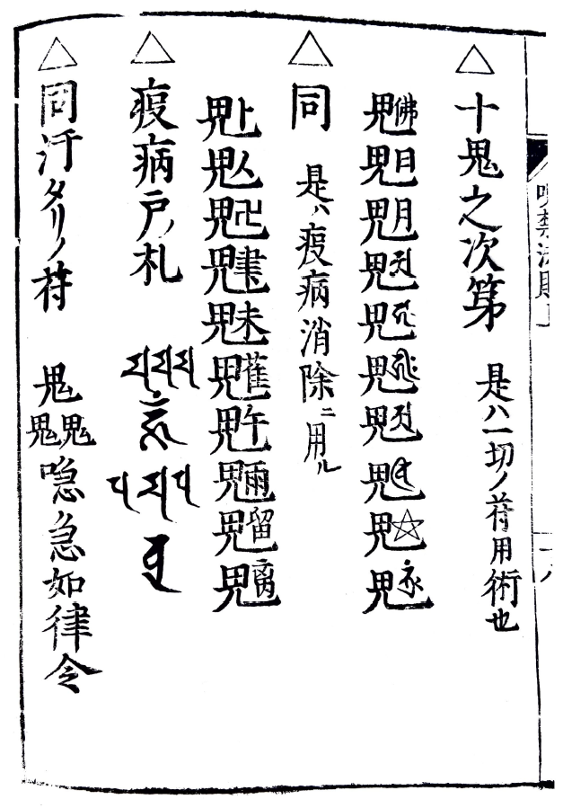
Image 09, on the other hand, gives us another historical precedent: this time, Sanskrit has been integrated into the base text and appended with furigana in a manner identical to that witnessed in Lee’s use of Hangul in Yuhi and Yokoyama’s use of simplified Chinese Sinographs in I Will Become a Cat.
This should not be surprising: all these texts, even in the transition from manuscript to print (to digital) culture, are operating under the same architecture of script.
Conclusion
With the characteristics of the architecture of written Japanese explained, in the next installment I will explore how the creation of a unique text-world can be fundamental to understanding and reading some function. I will also examine how one contemporary author is pushing the architecture of the Japanese script to its limits by imagining, among other things, Sinographs resisting standardization in the face of globalization(s).
[1] Per Linell, for example, has demonstrated how a written language bias (WLB) in linguistics – one in which aurality is the target of analysis but the written word is how it is accessed – led to “a paradox; it proclaimed the primacy of speech and spoken language, and yet it largely stuck to the traditional methods and models developed for the study of written language” (“The Written Language Bias [WLB] in linguistics 40 years after,” Language Sciences, Vol. 76, 2019:3). This quote comes from Linell’s reflection on his important study The Written Language Bias in Linguistics: Its Nature, Origins and Transformations (Taylor and Francis, 2005).
[2] To be clear, this does not mean spelling variation cannot signify meaning. The so-called eye dialect, for example, wherein one spells words through intuitive spellings (e.g., “pleez” for “please” or “helluva” for “hell of a”) with the intention of signifying some extra-linguistic context, is often tied to extraliterary elements such as class, race, and/or education.
[3] Sophocles, E. A. History of the Greek Alphabet and of the Pronunciation of Greek (1848): 1-2. His classic study is in the public domain and freely available online, for example, here.
[4] It is not generally claimed that the Greek and Hebrew alphabets are directly related one another. Rather, it is more likely stated that they are distantly related to each other via the same Phoenician alphabet. The first four letters of said alphabet –  (from right to left: alep, bet, giml, dalet) – have clear correspondences to both the Greek (A B Γ Δ) and Hebrew (א ב ג ד). Bearing in mind that Greek is written from left to right, and Hebrew right to left, and that letters would at times be flipped, reversed, and/or tilted, helps make these connections clear.
[5] Lehmann, Reinhard G. “27–30–22–26 – How Many Letters Needs an Alphabet? The Case of Semitic,” in The Idea of Writing (Brill, 2012: 18-9).
[6] This is an oversimplification of a complicated reality. As one might expect, vernacular or variant (hentai) forms of literary Sinitic developed across East Asia. My interest lies is in the fact that these variants, too, are all written in Sinographs. In recent years there has been great interest in this topic and much scholarship available in English. For example, see Bunkyo Kin’s Literary Sinitic and East Asia: A Cultural Sphere of Vernacular Reading (2020), Saito Mareshi’s Kanbunmyaku: The Literary Sinitic Context and the Birth of Modern Japanese Language and Literature (2021), and Gordan Schreiber’s Japanese Morphography: Deconstructing hentai kanbun (2022), all from Brill. Schreiber’s text is focused on variant forms of literary Sinitic.
[7] In Unicode, for example, it is named “IDEOGRAPHIC NUMBER ZERO” in English and “漢数字ゼロ(レイ)” in Japanese. Since it is not considered a Sinograph it technically lacks a semantic classifier (部首).
[8] This important topic has been the focus of much recent English-language research. Two examples include Christina Yi’s Colonizing Language: Cultural Production and Language Politics in Modern Japan and Korea (Columbia University Press, 2018) and Cindi Textor’s forthcoming Anatomies of Incoherence: Zainichi Literature and the Intersectional Politics of Speech (University of California Press, 2024).
[9] Yangji, Lee, trans. Cindi Textor and Lee Soo Mi, Nabi T’aryŏng and Other Stories (Seoul Selection U.S.A., 2022: 92).
[10] A digital version of the manuscript is available online through the Waseda kotenseki database.
[11] The term manzai has a long history. As Gerald Groemer notes, “Manzai, literally ‘ten-thousand years,’ was an abbreviation of the term senzu manzai (‘One-thousand autumns and ten-thousand year’), a turn of phrase associated with millennial prosperity and longevity bordering on permanence. The roots of senzu manzai as propitious dialogue and dance penetrate so deep into historical time they have become invisible,” Street Performers and Society in Urban Japan, 1600-1900: The Beggar’s Gift (Routledge, 2016): 152. Groemer notes that they would also perform in various aristocrats’ homes around the New Year, cementing their association with the season. In earlier periods their dress often included the folded eboshi and the suō, but in later years performers would wear a pointed hat (kazaori eboshi) and a hitatare, formal clothing for men worn at times of leisure, with large patterns. While banging their waist-drum (koshi tsuzumi) they would sing greetings, dancing and walk about. (152-3)
[12] Image 08 and 09 are taken from Edo jujutsu kyōhon: jakyō jugon hossoku 江戸呪術教本:邪兇咒禁法則, ed., Haneda Shukai, Kashiwa shobo 2006: 42; 71.